

THE RIGHT INGREDIENTS FOR A STRONG FOUNDATION
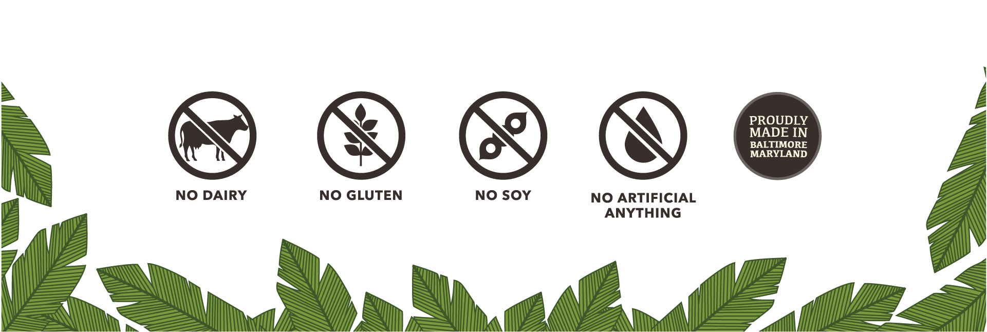
Cajou had a bold vision. Not only did the company have aspirations to bring consumers healthful, plant-based products (across a variety of eating occasions), leveraging fair trade relationships with farmers in the West Indies to source ingredients responsibly for their line of frozen desserts, they sought to inspire the palette with bold, unique, globally-inspired flavors.
Additionally, as a worker-owned cooperative that employs former felons, Cajou has a progressive mindset that a lot of consumers can get behind.
After experiencing some modest success locally, with a few restaurant and retail accounts, company leadership realized that meaningful growth would require evolution of the brand story, identity, and packaging design to position the brand for long-term success.
We’re inspired by the simple cashew (cajou in French). Used around the globe in just about every way imaginable, we not only recognize its versatility, we see it as a symbol for innovation and reinvention; an acknowledgment that ingredients, like people, can become something better. As a worker-owned cooperative that employs former felons, that’s a pretty meaningful idea. Cajou brings healthful plant-based foods with unique global flavors–and a spirit of renewal–to the kitchen table!

EMBRACE THE PASSION
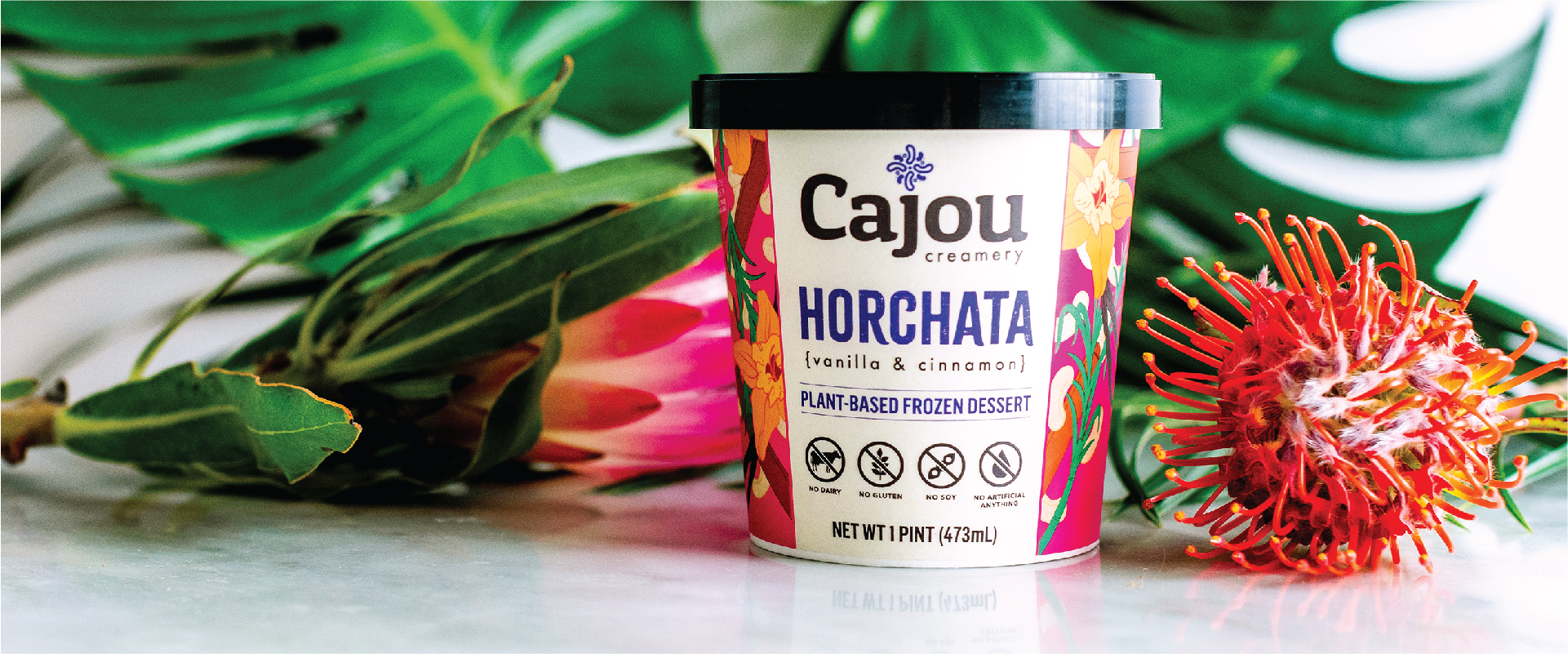
Everything this brand does is with passion and vibrancy. It’s only fitting that the packaging should match that fire and spirit. Our solution was bold, fresh colors with stylized custom illustrations of each product’s ingredients. This combination of color and flavor is what gives Cajou its distinctive look.
We went from labeled plastic containers to printed, paper ice cream pints. This gave the brand a professional look that can compete well at both the retail shelf and online.
Cajou has since opened a physical cafe in an historic Baltimore neighborhood, which has allowed the business to expand its presence and own its manufacturing.


Leave a Reply