

Foraged & Found is an Alaskan food manufacturer that is doing tremendous work to bring awareness to non-traditional, native Alaskan food ingredients, like bull kelp and sea asparagus. With a robust portfolio of food products that includes common favorites supercharged with wild-foraged superfood ingredients, like salsas, pickles, pesto, and sauces, they cleverly introduce these nutritious, natural plants in an approachable (and delicious!) way.
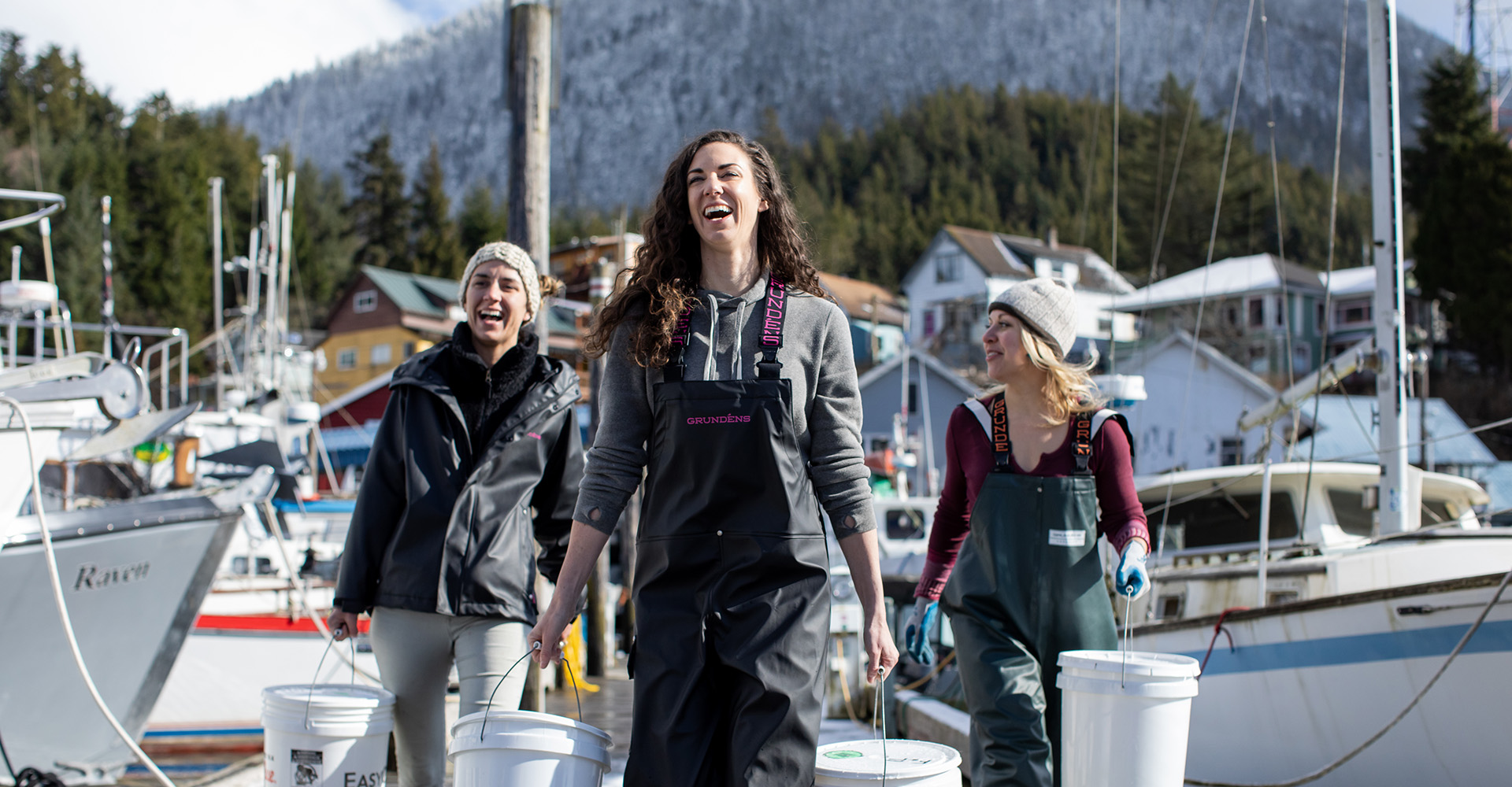
After experiencing some success locally in southeast Alaska, based in the popular port city of Ketchikan, the company’s three female founders decided to expand the brand to the US mainland.

Like a lot of scrappy startups, Foraged & Found needed to be nimble in the beginning. Bootstrapping and relying on friends and family for help, they developed an identity, packaging design, website, and all of the necessary tools to get to market. But, all too often, a brand lacks the polish necessary for meaningful, next level success, and this was the case for Foraged & Found.
The soul of the brand was more or less right, but there can be a fine line between an appealing natural look and something too raw and amateur. The original identity and packaging had a natural, craft, authentic, and wild feel. The logo had the sensibility of hand-drawn letterforms, and the kraft paper background lent some grit and texture to the packaging labels…but the logo had thin characters that were difficult to read at smaller sizes. The kraft paper background on the label muted colors, making some content difficult to read, and there were a multitude of regulatory concerns that would never fly with the FDA. With a goal to expand distribution, changes needed to be made to maintain the integrity of the brand’s wild spirit in a more professional, polished, marketable way.
We started, as we always do, at the foundation of the brand. With an engaging brand story meant to establish the blueprint for theme, personality, and position, we created a narrative that reflected the ethos of the brand…

Nowhere in the world is premium superfood more abundant than in the wilds of Southeast Alaska. Surrounded by awe-inspiring mountains and crystal waterfalls, at the perfect intersection of land and salty sea, nature deposits her entire arsenal of life-giving vitamins and minerals — as well as tender, delectable kelp, flavorful, nutritious sea asparagus, and more. The richness of the environment is reflected in the unique flavors you’ll find from Foraged & Found.

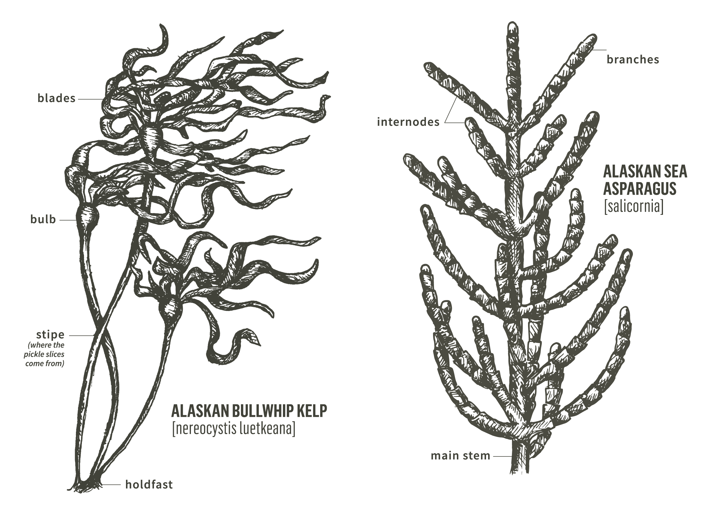
From this inspiring description we crafted a new brand identity. We wanted to maintain the approachable, natural, crafted character that the original identity tried to capture, while giving the new logo more presence and more flexibility across a range of sizes, uses, and mediums. Our solution was a hand-drawn wordmark. The primary version featured a rustic, kraft texture, with various versions (1-color black, reverse white, favicon, with WILD ALASKAN PROVISIONS tagline, etc.) for a range of use cases.
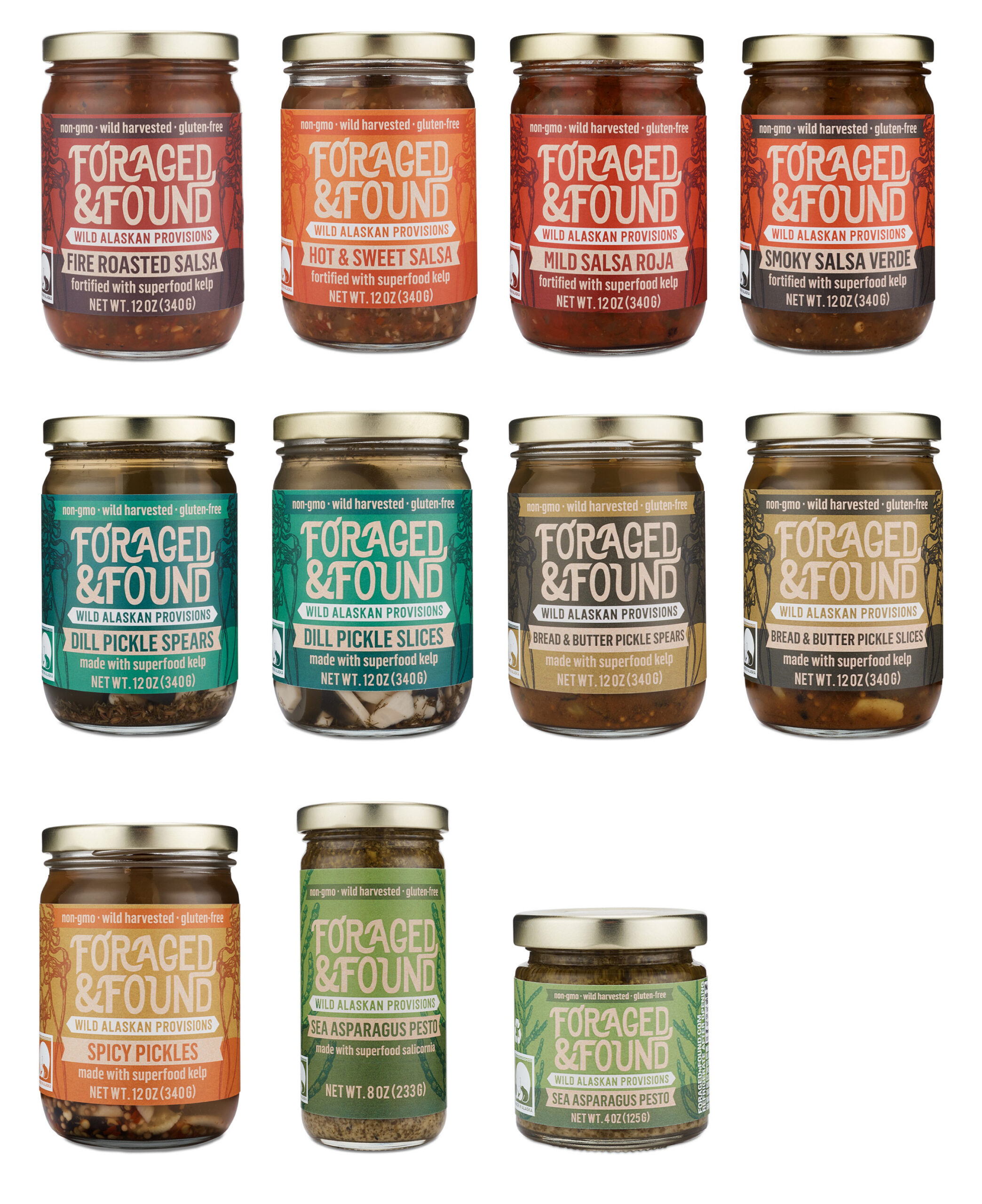
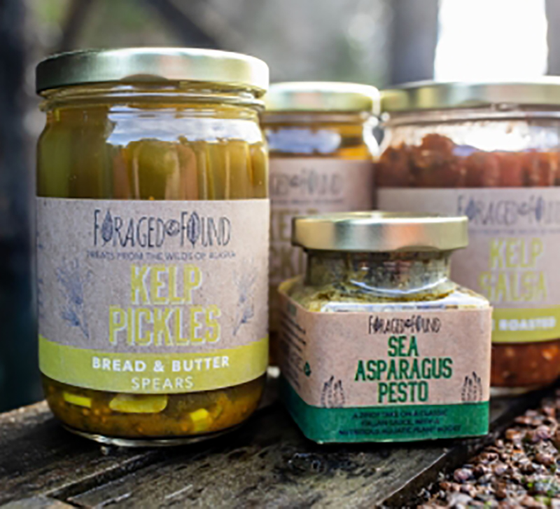
To elevate the packaging design, we used more color, while maintaining the gritty, natural kraft texture, and adding some hand-drawn, botanical-style illustrations of kelp and sea asparagus plants. While the original packaging utilized a kraft paper, the colors were flat, so our solution was to use a typical (and more durable) white film label with a premium matte finish. With high-resolution kraft paper imagery built into the design, the labels were faithful to the natural look and feel, while also being strong, water resistant, and beautiful. We also developed a more strategic color palette to differentiate product categories and SKUs within each.
Once packaging was finished, quality custom photography was needed for sell sheets, the web, social media, and other promotional scenarios. For a brand with unique items like kelp slices and sea asparagus pesto, stock photography simply doesn’t exist, and showcasing the form of the product to the consumer is critical. We brought in CMP Studio to shoot product strip-outs and several styled tabletop scenes focusing on each product category.
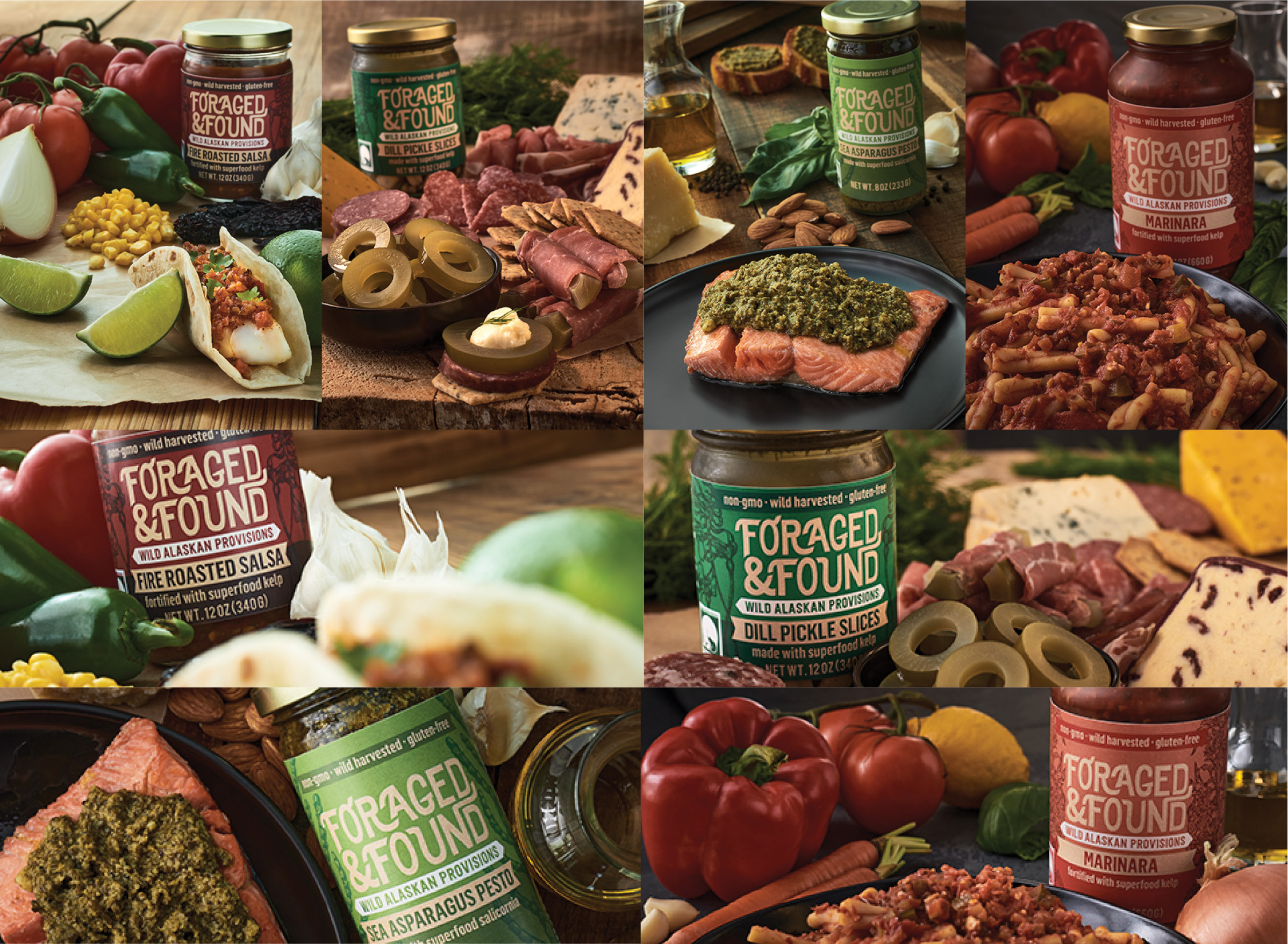
We also developed a suite of custom icons for ingredients, product attributes, and other graphical depictions. This allowed us to add an additional dimension of texture and depth of product detail.
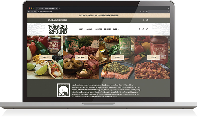
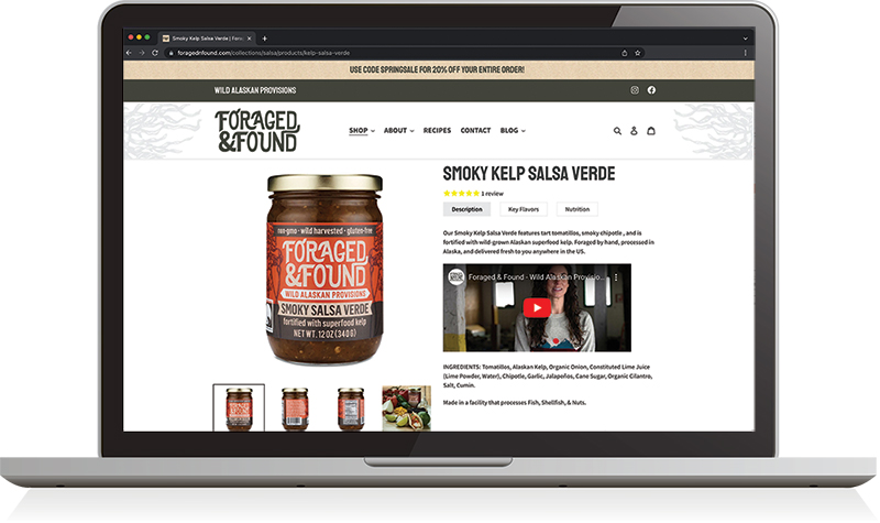
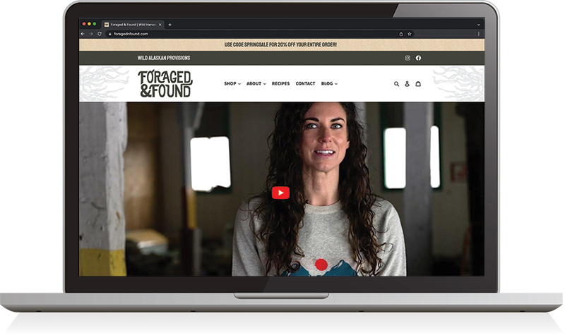
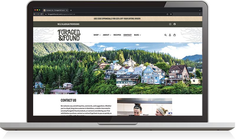
With branding, packaging, photography, and other graphics complete, we got to work on the ecommerce web presence. We don’t often build sites in Shopify (for various reasons), but in this case, it was required. We first created the site architecture and content plan to determine the navigation and structure of the site and to write the content. We designed all of the pages, keeping functionality and user experience at the forefront of our process. We worked with a developer to custom build the site within the Shopify framework, ensuring that imagery, font styling, and layout (both desktop and mobile) were pixel perfect.


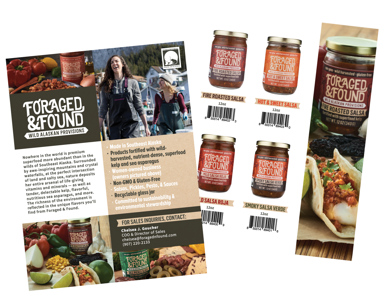
With a sales strategy that included retail, we connected Foraged & Found with a food broker that could help them conquer mainland USA. We designed sell sheets with wholesale, distributor, and no price versions for various sales scenarios, using the new photos and content developed through the process of the project.
Leave a Reply