

THE FIRST HAYMAKER DID NOT LAND
When we first encountered Haymaker, they were shifting product focus. Their first offering, a line of hydration beverages, had modest success, but their new 1 oz elderberry wellness shot was the future.
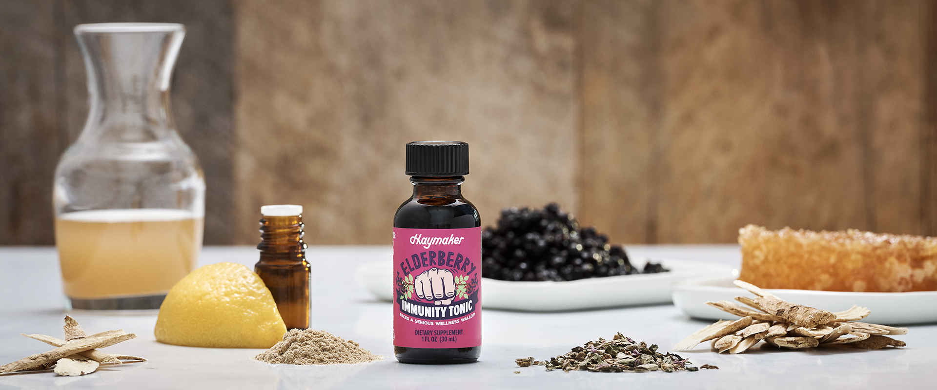
For an immunity product with cold and flu fighting ingredients like elderberry, raw honey, raw apple cider vinegar, echinacea, astragalus root, turkey tail mushroom, and lemon oil, the name, Haymaker, conjured obvious, bold ideas of strength, fighting, and defense. After a sip of the product, it became even clearer that this was a perfect name for the product, as the bite of apple cider vinegar made for a breathtaking product experience that felt like a knockout punch to the senses!
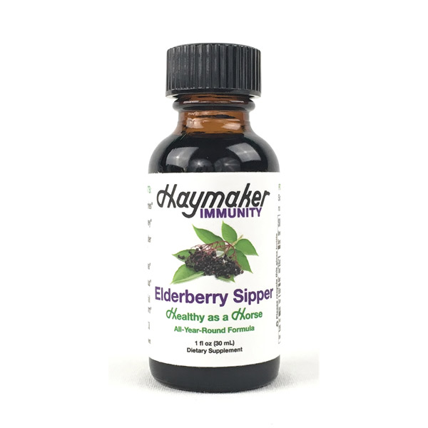
Good branding is about connecting dots. It’s a matter of carry-through. Haymaker had clearly found a great way to represent the product to the consumer conceptually, but the execution was all wrong. The first iteration of the label was a clean white design with a tiny photo of elderberries, some vague callouts (“Healthy as a Horse” and “All-Year-Round Formula”) and no allusion to the intense experience and efficacy of the product beyond appending “Immunity” to the logo.
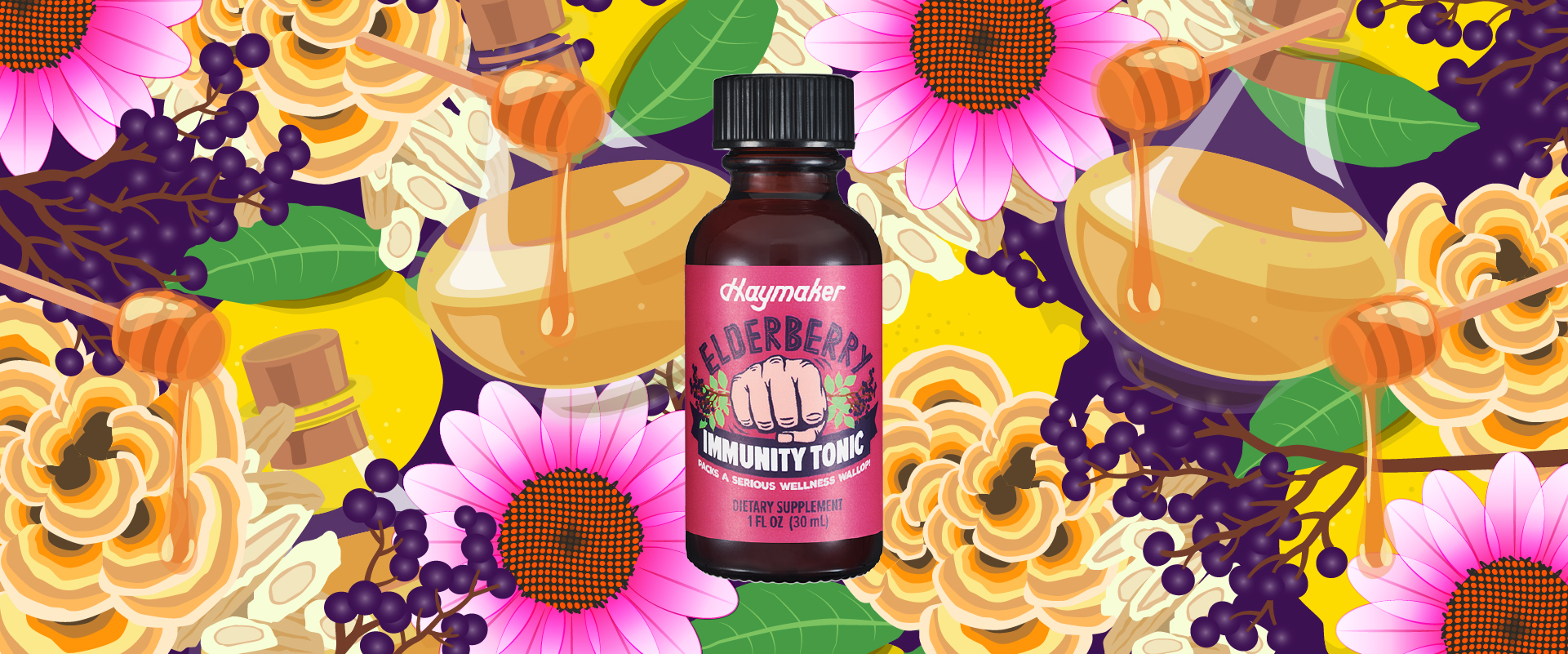
PACKS A SERIOUS WELLNESS WALLOP!
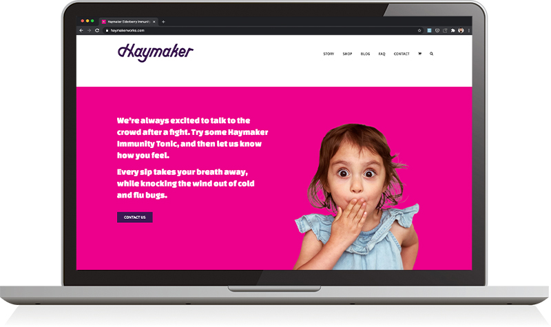
Like a wild, wailing haymaker, our Elderberry Immunity Tonic packs a serious wellness wallop! With the power of potent elderberries, raw honey, apple cider vinegar, echinacea, astragalus, turkey tail mushroom, and lemon oil, every taste is an herbal sucker punch to the senses and a boost to the immune system. Sipping Haymaker Tonics throughout the day is a surefire, natural way to keep the doctor away.
A BOLD RE-ENVISIONING
The brand needed a complete makeover.
We started by establishing a foundational story that set the stage for a more engaging, dynamic brand direction built around the concept of the haymaker punch and connecting that metaphorically to the product experience and powerful functional ingredients and attributes.
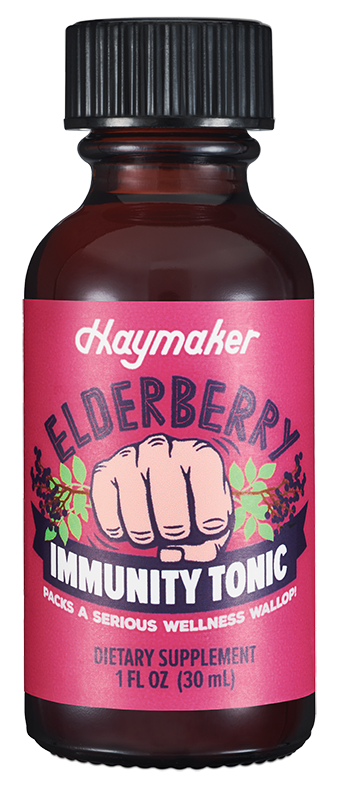
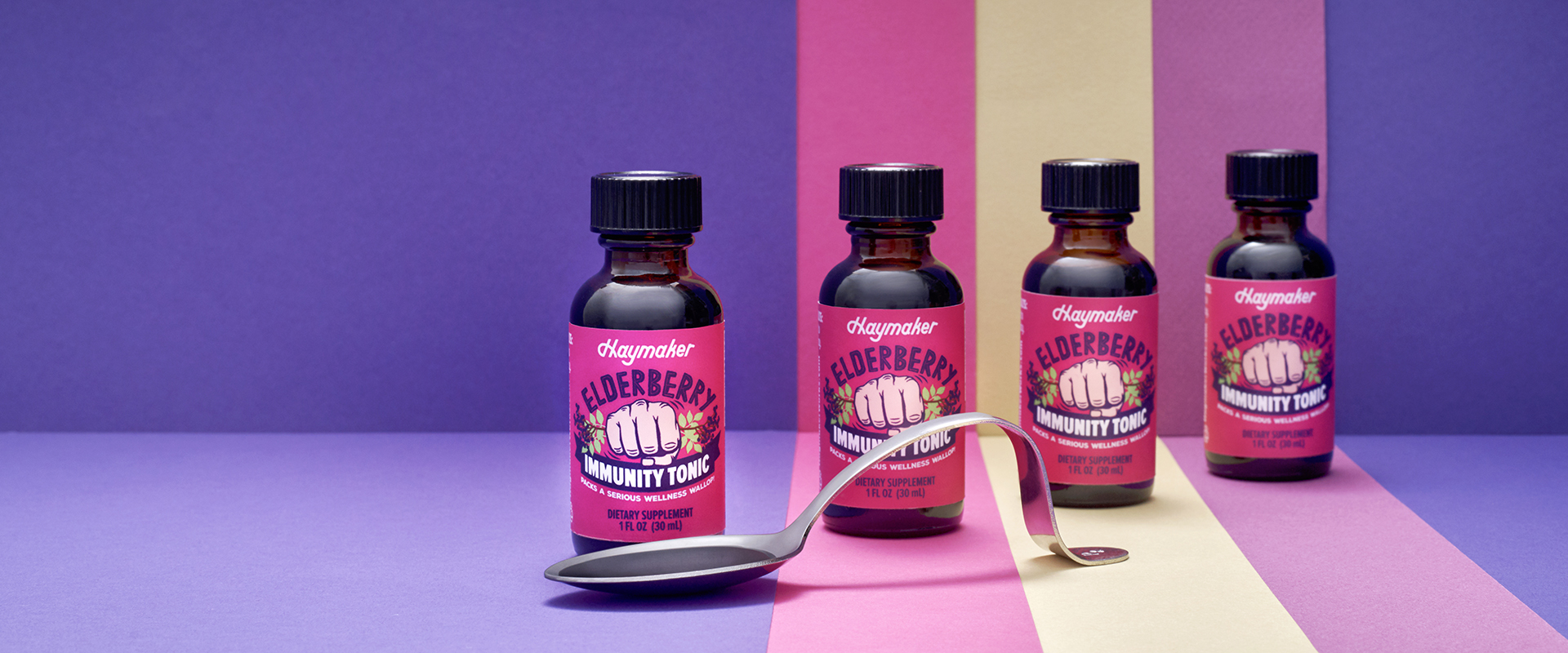
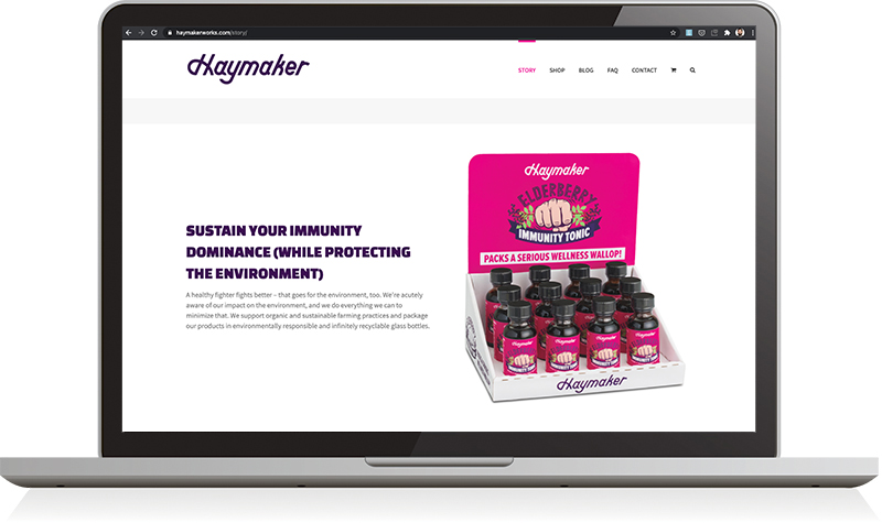
To breathe life into the visual representation of the brand, we established a bold, bright magenta and purple color scheme, and introduced some more organic illustrated elements and font styles with ingredient illustrations and an iconic “herbal punch” graphic that became the centerpiece of the new packaging design. This not only better represented the theme and personality of the brand, it gave the brand a very distinct look and set the product apart at the shelf and online.

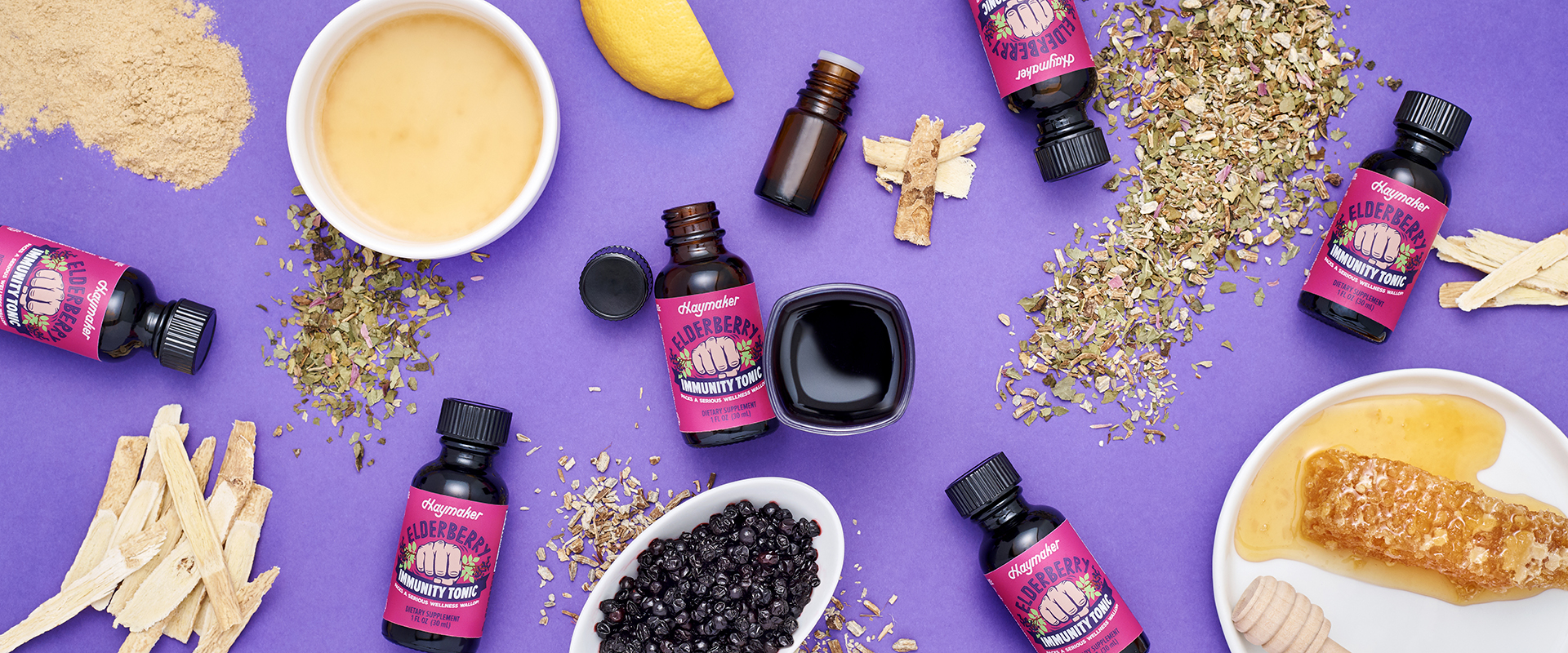
CUSTOM PHOTOGRAPHY IS ESSENTIAL
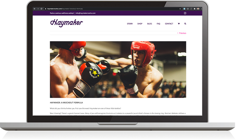
One of the most important investments a brand can make is in quality, custom photography. For a brand establishing a new, strong brand identity and personality, imagery helps paint the picture. We worked with Chris Malacarne to develop some unique shots that further defined the look and feel for the brand, and gave us some high-quality assets to use in sell sheets and on the web.
DIGITAL STORYTELLING
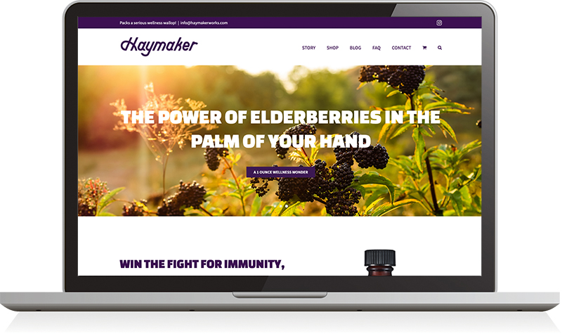
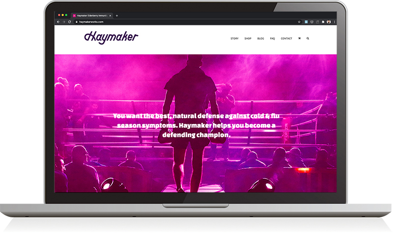
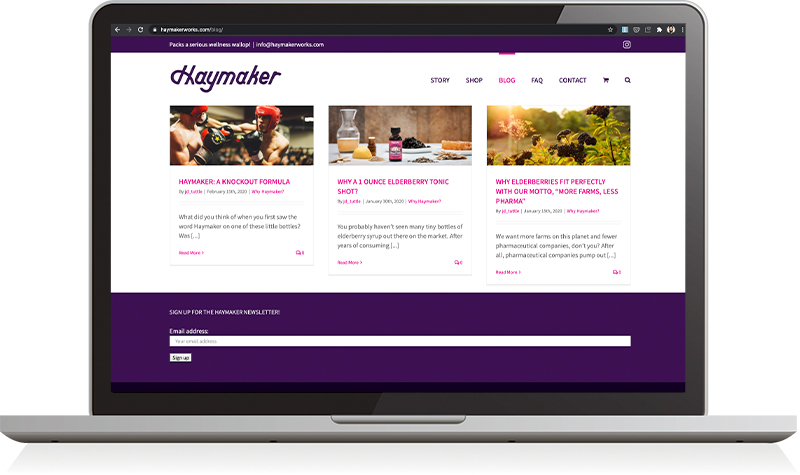
We use the web to tell stories. Once an overarching brand narrative has been developed, the web offers an opportunity to go deeper; to talk more about function, highlight key ingredients, bring fresh branding to life in new ways, and most importantly, to sell product. We developed the Haymaker website on the WordPress platform with WooCommerce as the selling engine. The site was simple, but optimized well for search, geared for the target audience, and build with speed and usability in mind.
Leave a Reply