

PREMIUM HULL-LESS HEIRLOOM POPCORN
A 5th generation family farm, located in Oneida, IL, Pilot Knob Comforts represents the savvy and ingenuity of the modern farmer. With the bulk of their business coming from commodity seed corn and soybeans, the current generation wanted to diversify. They found their niche in premium, hull-less, heirloom popcorn.
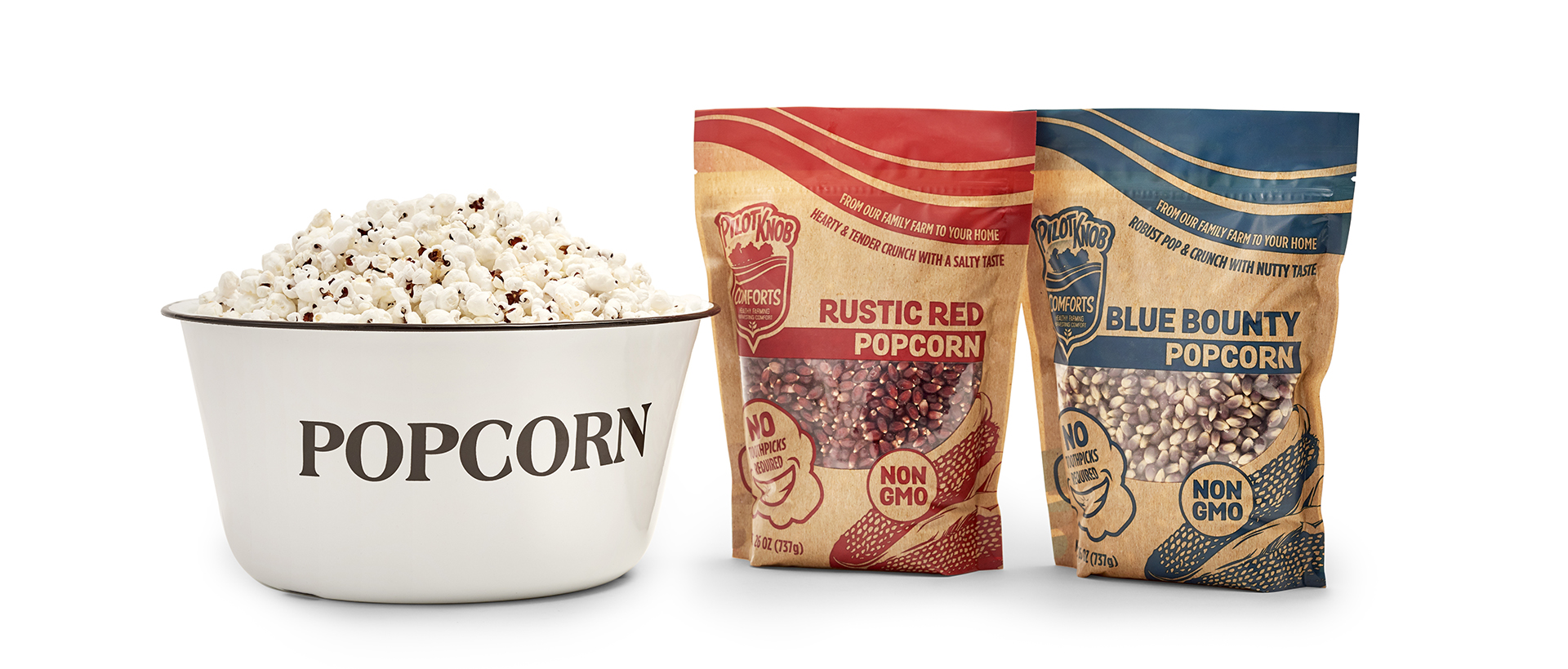
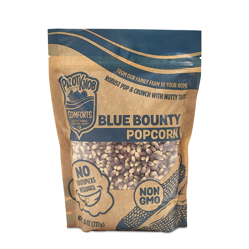
Pilot Knob popcorn is unique in taste, texture, and color; a throwback to the days when corn was often a little different product than what we consume today. With blue and red varieties, and a fun, innovative microwavable ear of popcorn, the company is having tremendous success, and dedicating more fields to their popcorn passion each year to keep up with demand.
PACKAGING RE-ENVISIONED
Recommended to Upstart Food Brands by PCS Gourmet Foods, Pilot Knob was in need of a packaging redesign. While the former package was thoughtfully designed, it wasn’t performing well at retail, and the company sought insight to understand why. It was ultimately determined that the style of the design was too polished, and that a more craft aesthetic would better tell the authentic story of a generational family farm.
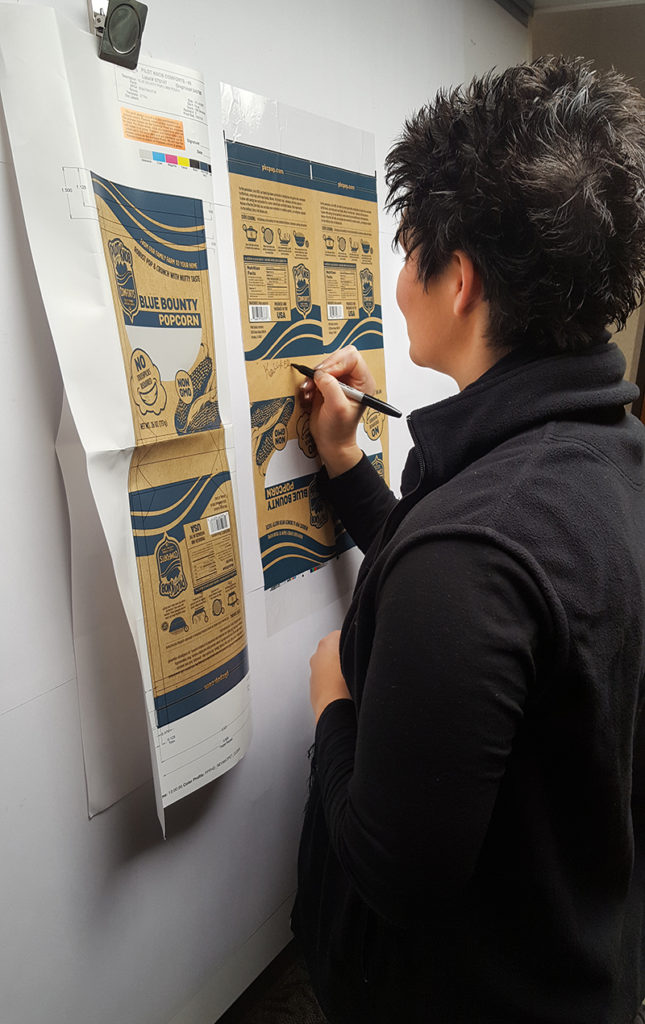
We utilized Pilot Knob’s existing logo, but most everything else was re-envisioned. We developed a concept that featured a kraft bag look with a simple one-color screen-printed appearance. But, because much of the value of Pilot Knob’s popcorn is derived from its unique color, an actual kraft paper bag, which wouldn’t allow for a window to show the product, would not work. Instead, we worked with the printer to devise a way to achieve a paper bag look through print processes. It was an ambitious, complex print job that began with a clear film. A kraft paper background was printed onto the film in process color, with a specific Pantone color used for the design of each package. A spot matte varnish was printed over the entire piece, except for the window. This allowed the product to show through a clear window, while the kraft paper background maintained a fairly convincing soft, flat appearance and texture.
Pilot Knob also had a product called, “Sower’s Snack”, which was a three-pack of popcorn cobs, dried to an exacting dryness to allow for perfect popping in the microwave. To ensure consistent branding at the shelf, we evolved this package as well, reducing the size to a single cob, and applying the same brand direction to the packaging. Additionally, we felt that we could improve sales with a more marketable name. We proposed the name, Popcob, which was a huge hit.
We also developed a 12-count Popcob display box.
GROWTH BEYOND THE FIELDS
To further orient the brand, we created a new e-commerce website with all new content. We provided photography, and direction to a local photographer, to produce new and engaging images, and rewrote all of the site copy to align with the new narrative and style.
Most recently, we’ve designed a glass mason jar package for their Rustic Red popcorn, which will be sold at high-end retailers, such as Nordstrom, Sur La Table, and Williams Sonoma. We printed directly on the glass with a minimal design to let the bold, red popcorn show through. We also designed a premium-looking hang tag, which highlights the Pilot Knob story.

RESULTS
So far, the packaging changes have been a resounding success. With increasing national distribution, and entry into higher-end retailers with the glass mason jar, Pilot Knob is starting to broaden its reach. Increased production, stronger sales, and a more relatable brand are positioning Pilot Knob for long-term, sustained success.

Leave a Reply